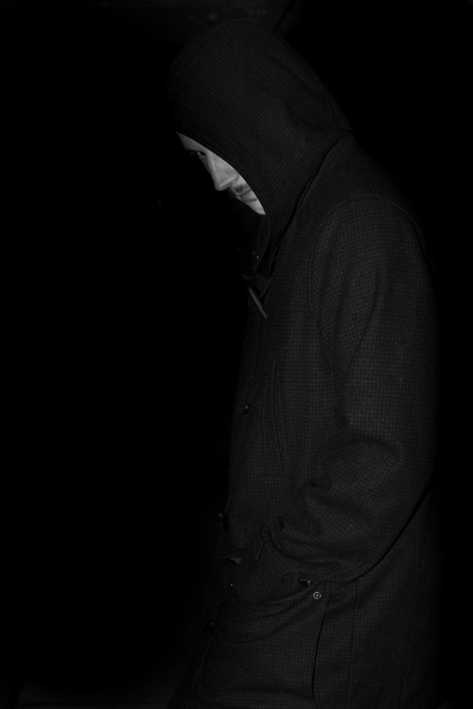
Conclusion of the module

To conclude the module as a whole I feel I have learned a lot and have improved my skills drastically for the good. In my opinion this module was like jumping into the deep end and learning about trial and error with being forced to have a strategic plan for a book or magazine cover has made me see photography in a different light that I never saw before. I now look at images and think about ways in which an image could of been achieved as apposed to just looking at something that may look nice on the surface but not really thinking any further. When I photographed for this module it really made me think about what and how I will achieve as I do feel I fell down a spiral of pointing and shooting without thinking I mean this by before I used to have an initial idea or image on my head of what I wanted to create but always ended up with something that was sometimes completely different to what I first imagined but now I have learned that is because I probably didn’t think strategically enough as to how I would achieve a particular goal because although photography is an art and is about my creative thoughts I also need to think realistically and use all equipment and ideas in a strategic way that will create what I want.

Book cover finals

To conclude the blog posts for this module I feel that my final 4 book covers are well put together and themed and have a very atmospheric look to them. The tinker Taylor soldier spy and A perfect spy and the two I’m most proud of as I did quite a lot of research into the two novels which is why I think they are the two most successful ones in my opinion. The other two I think are good and fit the theme well but I don’t believe they have much significance to the novels themselves simply because of the fact that I do not think I did enough research into them and they were sort of a last minute to use because I was originally going to do Coraline and fragile things but because my Coraline images weren’t so strong and weren’t professional looking enough I chose to stick with the one author that I have a lot of strong professional looking images for which is why the other two aren’t as strong as the first two simply because they weren’t as well thought out.

If I were to re do this assignment I would do extensive research into the novels rather than brief so that I had more ideas and back ups for shoots however for the purpose of the module I think I did well they are all themed the same, look professional and look like good striking images that you would see on a book cover.

Magazine cover finals

These are my final 3 magazine covers. Overall I think that they do the job and evoke the word given for each one, particularly the irrational behaviour and inspirational. The GQ one I feel I could of come up with a different idea as apposed to the camera and photography thing as I now feel it might throw people off and confuse them as to what the image is about.

The overall look of the final 3 I am happy with my best two I feel are the GQ and BJP one and I think this because they were both shot in a professional environment where as the guardian weekend wasn’t and had more floors in post editing as apposed to the other two.

In editing I did have to extend the background of both the GQ and BJP in order for them to fit the template well.

Overall they are a good set of images that fit the purpose well and do the job. If I were to go back and change the way I went about this module it would be to come up with a better idea for the GQ without the need of a prop to get a message across, not have rushed the location and way I shot the irrational behaviour shot so probably next one be more organised and plan my shoot well ahead instead of last minute that way I will get better quality images and finally if I am to shoot for a magazine or anything or the sort again think about positioning of the model to fit the text but other than those three points I am proud of these final images and definitely think I have improved and have learned a lot about working for something in photography with standards that I need to meet as I feel I have done that well.

Final 4 images from Jon Lee Carre novels

A perfect spy

A perfect spy was published in 1986 and it’s a novel about and agent who seems to be a perfectionist who has idealistic ways on how he does things.

This novel is about Magnus Pym a agent for British intelligence who goes missing after his fathers funeral.

After getting a brief overview on the novel I decided that I would shoot a portrait of who I believe Magnus Pym to be and shot him In a mysterious secretive way to show how someone might not want to be found and give off the impression of hiding and being missing,

Since it is a spy novel I chose for my model to wear a duffle like coat that might represent that he is a well put together man who might have a good job but on the other end of the picture his hood is up, you don’t know where he is and he looks suspicious and to me it would leave you asking questions and that’s exactly what I wanted which is why I chose to blacken out the background and enhance the foreground.

The smoke coming from his mouth was chosen to represent being outside in the cold as that was the location I short in and I wanted to leave a little indication of where he was but because these are spy novels I also wanted to not include too much just little clues and I feel it’s worked well for this particular image.

I chose to turn my images into almost black and white to show an age to them but also because a lot of my influences for this module were shot in black and white and I thought black and white fitted the novels better because they were written years ago.

Tinker Taylor soldier spy

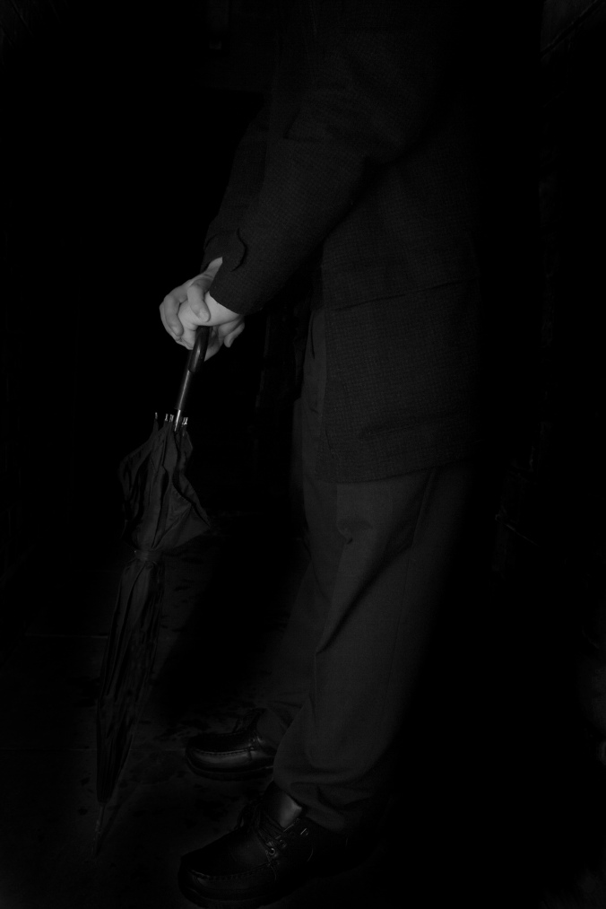
Tinker Taylor soldier spy is a novel about an agent called George Smiley who uncovers a secret mole in the British secret intelligence service.

Because George Smiley is a big influence in a lot of the Jon Lee Carre spy novels and he’s the main character in Tinker Taylor soldier spy I decided to look up the character for this one to see how he is perceived and looks.

As it was a big hit and there had been a few films about this character it wasn’t hard to find. Some significant things I found about him were his glasses, clothes he wears and in a few he is holding a black umbrella which to me I thought was different to all the other book covers and photos of him so I decided to focus on that. Although it is a small detail about him it’s made a very good image that fits the character and novel perfectly in one image.

Because my model wasn’t as old as the character I decided to shoot and focus on on the hands and umbrella to give off a more questionable image a question of who that person is and what are they waiting for which to me is perfect for a spy novel.

Again to fit the theme I chose to take down the vibrancy completely so that it looks old and fits the purpose of a late 70s novel.

Although I have blackened out the background again, I chose to leave some detail on the floor to represent being outside again which in this image is the specs on the floor outside which I feel gives quite an atmospheric look to the image and sets the scene more.

A delicate truth

This is about a civil servant who is recruited to take part in a covert mission.

The employers of the operation become suspicious of him so I decided to shoot an image of him looking very suspicious and possibly guilty of something but also I also think the image itself might evoke some feelings of a truth or suspicion on someone which is why I chose this image for this particular novel.

Again the hood is up to give off feelings on identity and hiding something. It is again shot and edited to black and white to fit the one of the novel being in 2008-2011 but also the theme of the other images I shot.

The secret pilgrim

The secret pilgrim is about former agent who talks in first person narrative about his experiences in the absent service alongside the famous George Smiley.

Again this image is supposed to represent the main character Ned and I chose this one out of all the others because it is mysterious and atmospheric like all others in my series of images not only that the way he is looking into the camera might suggest that there is definitely a story to talk about which is why I chose this one for The secret pilgrim.

Final magazine cover image ‘Irrational behaviour’

This is my final image for the guardian weekend shoot. A lot of my images were set out like this but can not seem to find them however, luckily I have my final image that was saved on my Memory stick.

The initial idea was to create a photo of a formal looking person who is dressed up smart and have them pulling faces that you wouldn’t expect from someone who looks like that.

As the shoot went on I decided that I would have him wear his tie around his head to make the image and his behaviour even more irrational and to me doing this was successful and worked well for the purpose of the image. When I look at this image, to me it screams irrational behaviour while at the same time being white comical.

Jon Lee Carre book cover shoot and change of plan

I have changed my idea to where my 4 photos are going to be from Jon Lee Carre’s spy novels. I’m doing this because I got a lot of shots I’m proud of from this shoot and feel they fit the purpose of the other book covers and would fit well together.

When shooting this I asked him to stand in an alleyway where I could blacken out the background in post editing and take some mysterious looking shots of him against the wall and also some posey mysterious portraits. My model smokes and it was quite cold outside so I asked him if he could blow out his smoke as I take the photo to capture it on the air and I feel it leaves you questioning whether it’s smoke or his breath because of the cold and I think that holds another mystery as it leaves you asking questions about him.

To create the atmospheric look I wanted in the dark I chose to shoot at night with my continuous flash witch lighted up him and his face and the background not so well lit which is what i wanted as it made him the main focus of the image but it also made it easier for me on post editing to darken out the background and lighten up the foreground if needed be.

Ideas and inspirations for Tinker Taylor soldier spy

Looking at the Tinker Taylor soldier spy book covers they all appear to be very different in their own ways. Some are silhouetted figures which I am more so drawn to as I feel it has a more stoking atmospheric look and some are more creative and less literal. Because I have never read or watched any of Jon Lee’s novels and don’t have much knowledge on them I think I will use a model to play as the main character Smiley and go from there also play around with lights and silhouetted figures.

Inspiration and ideas for fragile things

The book covers for this short fiction book are all mostly of leaves and I think this is because it’s simple yet effective because a leaf is considered to be something that is fragile. Another thing I would need to keep in mind for this book cover is that there isn’t one way I could go about this as there is many different story’s and poems within the book that I couldn’t possibly fit all on one photo so like many of these cover I need something simple yet effective.

As for the colour theme I am more drawn to the darker coloured book covers because I feel it would match the Coraline book cover better because they both need to be paired and themed with each other.

Ideas and inspirations for Coraline

Looking at all the book covers/DVD covers for Coraline I found that a lot of them use Coraline herself as the main feature of the pictures and I like that but as I am not being literal I want to try something different possibly using a significant object rather than a model like a button or some needle and thread something subtle but shot in a way that is intriguing to the eye.

To keep the theme of the story and the way that a lot of these book covers are I will keep the dark blue/ purple colours as I think it stands out well but will also fit the purpose for a Neil Gaimen book.